- Joined
- Apr 26, 2020
- Messages
- 1,716
- Reaction score
- 2,501
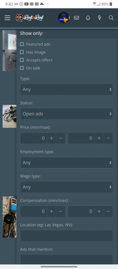
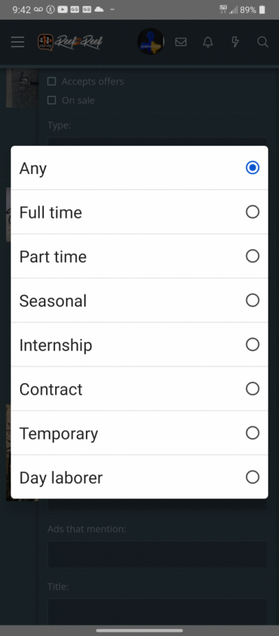
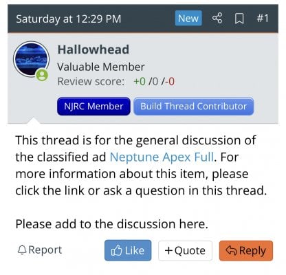
It’s a very confusing interface especially on mobile. I can hardly figure out how to post an Ad or how to give feedback etc. it’s also more frustrating to have the ad in a different link than the discussion and makes it confusing to see the photos for the ad being discussed in the discussion. I just always use the market place tab still. The old way of posting was pretty simplistic but I prefer it to what we have now. The classifieds just need to be made much more intuitive. Make it one post with the discussion below no a separate link, make location more obvious and at the top of the ad not the bottom. Make feedback for purchases an obvious button or something you can easily send to a user. Making any build threads connected to an ads creator linked so people feel comfortable shopping from them I think would be a good addition as well as a link to history of past transactions. When all sales are closed, have the creator have to mark who the buyer was or put something like “other” and have it in the history so new buyers can contact previous ones as references…


