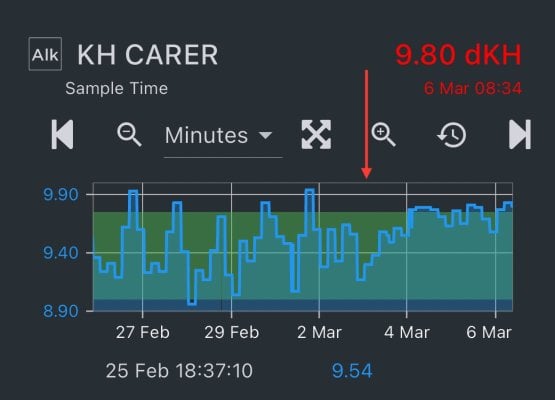
Just re-calibrated the PH probe on my KH Carer after a month of use, which was also calibrated during setup. The red arrow on the chart is the calibration point. Curious to know why the chart has a tighter range in alk reporting, and what part of the chart may be more accurate, and why? I dose kalk 24/7 evenly over 96 doses, and am not dynamically dosing anything else, so I’m inclined to think the larger swing part of the graph is more accurate, but don’t know what I base that thought off of…


